UI/UX design
Interfaces with the quiet confidence of a well-made tool.
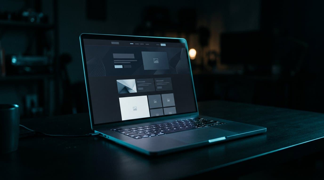
Product and website design for teams who want cinema in the craft and calm in the use.
Decoration is easy to buy and hard to live with. We design systems — type, space, components, motion — that can survive new pages and new features without going cheap.
The work is visual, but it starts in language: what the product is called, what the primary action is, what should never compete with it.
Benefits
What this changes in the business.
01
Fewer invented screens
We reuse with intent. A button that means two things is a future support ticket.
02
Design that engineering can trust
Specs are named, spaced and tokenised so implementation is not guesswork.
03
A brand that can go quiet
Premium does not mean loud. Restraint is part of the identity.
Process
How the work moves.
01
Listen for the verbs
Book, pay, apply, track, refer. The product is what people do, not what the landing page claims.
02
Draw the system first
Type scale, colour, grid, states. Moodboards come after the rules, if they come at all.
03
Prototype the argument
Controversial flows are made clickable. We do not debate captions on static artboards forever.
04
Hand over a living kit
Files, tokens and notes. Design debt is documented, not hidden in a private canvas.
Technology
Tools we actually ship with.
- Figma
- Design tokens
- Framer Motion
- Next.js
- Accessibility checks
Questions
Straight answers.
We prefer to own both, because the craft shows in production. Design-only is possible when the engineering partner is clear and close.
Places
Where this work sits.
Industries
Sectors that often need this.
Journal
Notes on the same craft.
Start a project
If the product looks expensive and behaves cheaply, the interface is the brief.
Tell us what you are building. We will reply with a clear next step — usually on WhatsApp.